taps logo over image

Taps, a Data Science Tool

scope: BRANDING

Taps increases the outbound sales results of B2B companies, using decision science and technology based on historical sales data.

the challenge was to create a branding package that felt fresh, modern, and trustworthy, while also hinting to elements of what exactly the tool can do. we wanted to create a mark that showcases how technology and humans work together. I created go-to-market branding and guidelines, as well as ancillary marketing materials to help explain how the business works.  

A logo with a purple circuit-style hand icon and the word 'taps' in lowercase white letters, with the slogan 'tap into your company's potential' in purple text below.
Comparison of two logos: the initial logo features a geometric design with blue and green hexagons above the word "TAPS," and the revised logo features a purple circuit-line hand symbol above the word "taps" in bold purple letters.
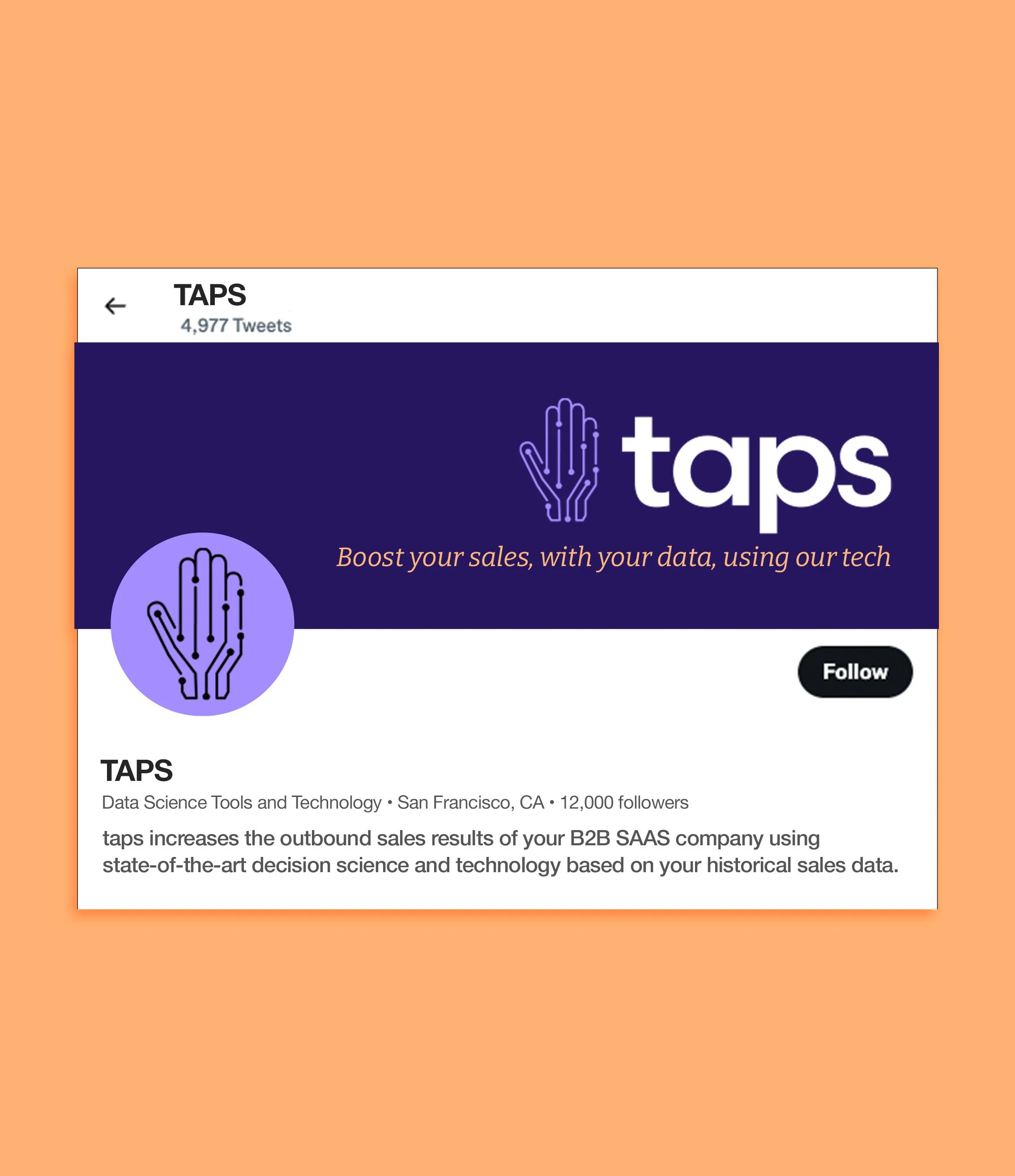
taps linkedin example
taps logo on letterhead
Screenshot of a case study presentation slide with a purple and white color scheme, titled "CASE STUDY," about a SAAS company and lead prioritization project, highlighting problem and effect with text.
taps logo on tote bag
A website interface with the phrase "Tap into your company's potential" curved at the top, and four colored rectangular buttons below in navy blue, lavender, white, and orange.
taps website mockup